————————————————————————————————
Monthly Discussion
Blue Chips
On this month’s discussion we address two major components of the DOW, Microsoft and General Electric. Microsoft has been a topic for previous discussions, see Newsletters of February 20, 2000 and again of October 22, 2001. In the former Microsoft’s revenue was forecasted and in the latter its stock price. Today we will confront these forecasts.
Exhibit 3 is an update of a figure published in February 2000. The little white circles show what happened since then. The conclusion is that the outcome falls within the uncertainty of the forecast and that Microsoft seems to have reached the peak of its growth.
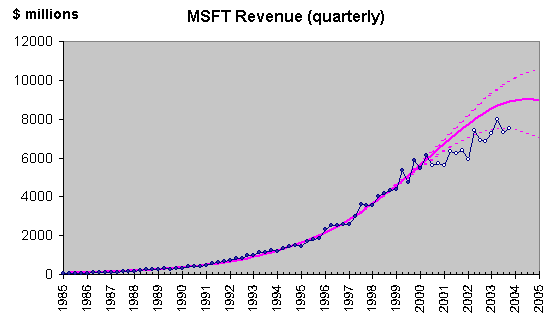
Exhibit 3. Microsoft’s quarterly revenue forecasted in 20-Feb-2000. The intermittent lines indicate the 90% confidence level (what is likely to happen 9 times out of 10). The little white circles are data since the forecast was made.
The price forecast was more
successful. Exhibit 4 shows what happened since October 22, 2001.
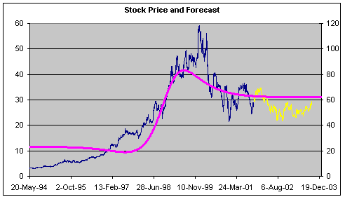
Exhibit 4. Microsoft’s stock price and forecast made in 22-Oct-2001. The yellow points show stock prices since the forecast was made.
Microsoft’s stock price seems to be
approaching the value forecasted two years ago. It must be recalled that the
forecast (purple line) in Exhibit 4 is not a fit to the price data (blue line).
This forecast—like DOW’s forecasts in Exhibits 1 and 2— results from treating
the company as a species, i.e. fitting S-curves on the dollar value and share
volume exchanged and then taking their ratio.
Encouraged by the success in
predicting Microsoft’s evolution I wanted to try another major component of the
DOW, General Electric. Exhibit 5 shows yearly revenues for GE since 2002. The
purple line is an S-curve fit on the data assuming GE is a species filling a
niche in a competitive market.
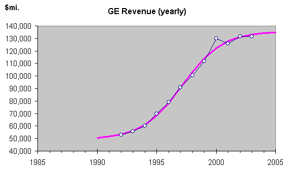
Exhibit 5. Total yearly revenue for General Electric (blue line) and S-curve fit. Growth again seems t have reached its ceiling.
The evolution of the data points follows an S-shaped
pattern and is rather amenable to an S-curve fit. And the curve is complete!
Once again no growth is in sight. As for the price, Exhibit 6 gives a forecast
in the traditional Growth Dynamics way, namely via share volume and dollar
value. The forecast indicates a horizontal trend at the level where the stock is
now.
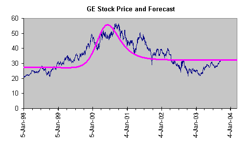
Exhibit 6. The evolution of GE’s stock price (blue line) and the forecast treating the company as a species (purple line).
Microsoft may not be as big as General Electric but
its daily dollar value exchanged is much bigger. Together these two stocks
account for 25% of DOW’s daily dollar exchange volume. One could be justified
to take them as a proxy for the DOW itself.
What
an unexciting picture! Companies that have completed their growth and stock
prices that are expected to remain flat. We would all rather see bullish trends
set in. Instead, and extrapolating from these two major players, DOW may be
facing a horizontal future (by the way, not unlike the one forecasted in
Exhibit 1).
Well, things could be worse; and there are ways to
make money from a flat trend. After all, there always are fluctuations!