————————————————————————————————
Monthly Discussion
The Coming of Age of the US
As the Olympic
Games came to a close earlier this month in Athens, Greece, voices were raised
about the number of medals won by the various countries and the rating of
countries’ performances. The US took home again the greater number of medals,
but some Greeks argued that considering the size (and budget) of their country
Greek athletes performed better. I tried to look at this question from
different angles.
It makes sense that a prosperous country with a large population should
have an easier time producing record-breaking athletes than a poorer smaller
country. But do things scale? Should a country with twice the population bring
home twice the number of medals? If this were the case, for the US to be as
"athletic" as Greece, it should have scored 432 medals, and for China
this number should rise to 1918!
Then is the question of prosperity. The richer a country the more sports
its people indulge in. In fact, I have demonstrated in Predictions that breaking the
one-mile-run record is an activity that correlates with economic well-being.
Prosperity and the leisure time associated with it seem to help sports. But
again a linear relationship between richness and the number of Olympic medals
won would not hold.
Someone also pointed out that this time in Athens, the Greeks entered an
athlete delegation greater than all countries. Before we scale the medals won
by a country we should perhaps first scale the size of the teams participating.
But there is another phenomenon that argues against simple-minded linear
relationships. Olympic performances are on the ceiling of the performance‑vs.‑effort
(or training, money, etc.) S‑curve. That is, doubling the effort
(training, money, etc.) in no way doubles the performance. However, other
things being equal, the smallest increase in effort (training, money, etc.)
would yield an increase—if infinitesimal—in performance, which with accurate
chronometers would lead to a medal. So the number of medals won say per
GDP/capita should make some sense, on the average!
But is the average the correct measure? With performances
separated only by thousands of a second, chaotic events (e.g., a small pebble
under the foot of an athlete) and other extreme phenomena (mutations are not
necessarily proportional to the population or to GDP/capital) would make this
measurement meaningless.
With a large delegation the Greek team was able to compensate for some
elimination of medals due to chaotic phenomena. Looking at the historical
records, it becomes evident that during the Olympic Games the hosting country
usually features a large delegation of athletes and reaps an unusually large
number of medals. But once again it cannot be argued that twice the size of a
delegation should yield twice the numbers of medals.
This problem appears overly complicated so I decided to look at a simpler
question via a relatively bias-free indicator. Exhibit 3 shows the evolution of
the share of Olympic medals won by the US over the years, leaving out the years
when the Games were staged on American home ground.
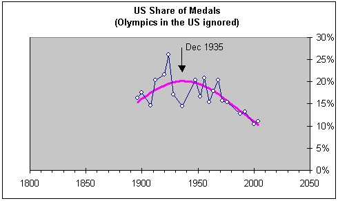
Exhibit 3. Percentage share of Olympic medals won by
Americans outside the US. The purple curve outlines a natural-life-cycle curve.
The date and arrow highlight the middle of the theoretical curve.
The idealized curve
(purple line) peaks in the mid 1930s, and at first glance, it may seem odd that
it is during the depression. But if we take into account two other indicators,
GDP and energy consumption, we see that US hegemony in the world reached its
peak during the depression.
Exhibits 4 and 5 show
respectively US energy consumption and GDP as a percentage of the world totals.
The story repeats itself. In both cases US dominance in the world goes up and
down with respective peaks in the mid 1920s and mid 1940s. The sequence of
events is interesting. First is the peak in energy consumption, ten years later
is the peak in Olympic medals, and another ten years later the peak in GDP.
These three decades straddle the depression, which however was not a uniquely
American phenomenon. The whole world underwent a depression. As a matter of
fact, judging from the three peaks in world shares, US hegemony was at its
highest during these three decades.
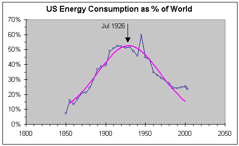
Exhibit 4.
American energy consumption as a share of world energy consumption. The
purple curve outlines a natural-life-cycle curve. The date and arrow highlight
the middle of the theoretical curve.
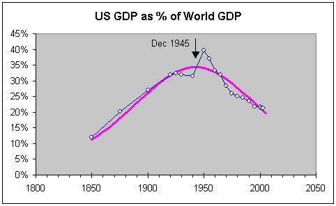
Exhibit 5.
American share of world GDP. The purple curve outlines a natural-life-cycle
curve. The date and arrow highlight the middle of the theoretical curve.
Declining
market share, negative as it may seem, it is not necessarily evidence of a
general decline. It is rather evidence of the rising of the rest of the world.
We have other examples of this phenomenon. IBM’s market share was over 90% of
all computers sold in the 1960s and has dropped to less than 50% today. The
appearance of many other computer manufacturers in the market caused IBM’s
market share to decline but the company itself did not shrink. On the contrary
it grew and stabilized profitably at a lower market share.
Exhibit
4 already shows some evidence of stabilization in US’s share of energy
consumption from 1990 onward at around 25%. There is a large part of the world
whose energy consumption still needs to rise. But a stable market share for the
US implies that its energy consumption will also be rising along with the rest
of the world.