————————————————————————————
Monthly
Discussion
Microsoft
Revisited
In
the newsletter of February 20, 2000 I discussed the future of Microsoft in
particular with respect to the possibility of a breakup. The conclusion then
was that a breakup of the company was unlikely and that even if it were to
happen, the company still had a considerable amount of growth to accomplish.
Exhibit 3 below reproduces the evolution of the company's revenue as it was
then analyzed updated with data points for the last six quarters (white
circles). In retrospect we can say that Microsoft grew at a somewhat
lower-than-expected rate but almost compatible with what had been forecasted
(i.e., it is within the 90% confidence-level range).
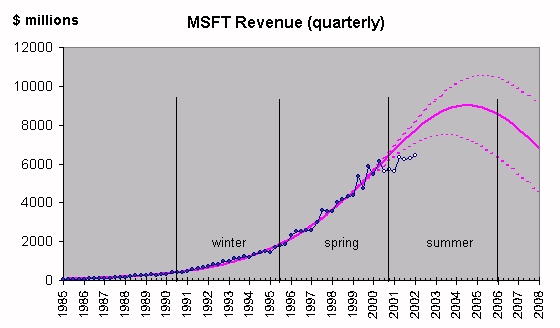
Exhibit
3. This graph originally published in
the newsletter issue of 20-Feb-2000 is updated here with data points for the
last six quarters (white circles). The seasons are redefined in terms of the
lower dotted line that corresponds to the 90% confidence level.
Microsoft seems to have entered its
"summer" season, meaning that its rate of growth will not grow
further but will begin declining around 2004-2005. However, this analysis is
rather crude because it checks the company's growth only in terms of one
variable, its revenue. We can try to confront this result by analyzing
Microsoft's stock price as a species (à la DJIA above).
Exhibits 4 and 5 show the evolution of
the stock's daily exchange share volume and daily exchange
dollar volume respectively over the last seven years. Natural-growth curves
are fitted to the data points, and then the stock's price is calculated as the
ratio of dollar volume divided by share volume. Both S-curves seem to have
reached their ceiling. As a consequence, both future projections are flat, at
least for a duration comparable to the duration of the rise (i.e., 2-3 years).
But important fluctuations around the level of the ceiling are inevitable, as
discussed in Chapter 10 of Predictions. We can already observe such
fluctuations, particularly in Exhibit 5.*
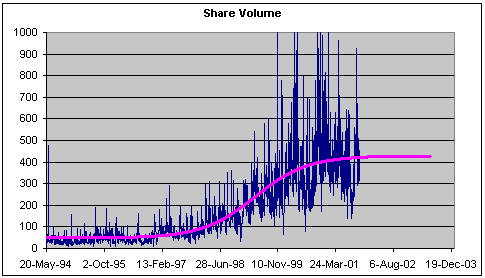
Exhibit
4. The evolution of the share volume of
Microsoft's stock and an S-curve fit. The data points are daily. This is the
"true" volume, i.e., corrected for splits. The vertical units are in
100,000.
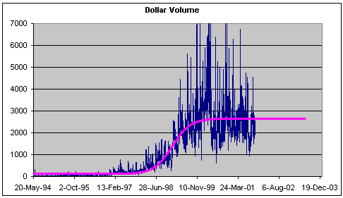
Exhibit
5. The evolution of the dollar volume
of Microsoft's stock and an S-curve fit. The data points are daily. The dollar
volume is obtained as the average daily price times the share volume of the
day. The vertical axis is in $1,000,000.
Exhibit 6 shows the evolution of the
stock's price in terms of both actual data and the above calculation that
results into a forecast. The purple line is not a fit to the data and yet it
describes well the stock's spectacular rise during the late 1990s and the
subsequent decline. The forecast stabilizes around $62. Of course, the price is
expected to fluctuate around this level significantly (the price is calculated
as a ratio of two numbers that fluctuate themselves significantly). But
Microsoft's stock will no longer reward its investors in a major way.
On the other hand, most Dow stocks may do worse than
Microsoft; see expected trend for the DJIA in Exhibit 1 (red line).
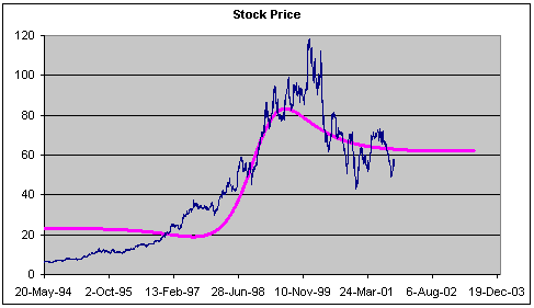
Exhibit 6.
The evolution of Microsoft's stock price (blue line) and a
calculation/forecast (purple line) according to the approach described in An
S-Shaped trail to Wall Street. The vertical axis is in dollars.