————————————————————————————————
Monthly Discussion
The American Economy Revisited
One Year Later
The Newsletter issue of October 14, 2002 discussed (and forecasted) the American economy in terms of three parameters: GDP growth, unemployment, and interest rates. One year later we are revisiting the subject to see how the forecasts fared and to make new ones.
As usually, my approach is that the American economy is growing like an organism, thus following natural-growth curves (S-shaped patterns). The three indicators considered below, are among the most frequently used to track the economy. In my effort to cover as long a timeframe as possible—meaning the longest stretch of time amenable to an S-curve description—I use data all the way back to the end of World War II. Decidedly, WWII was a singular event that set new natural-growth trends.
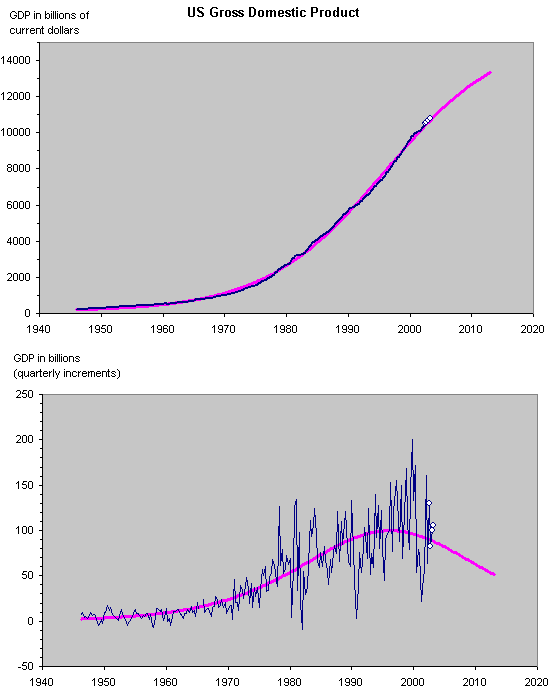
Exhibit 3 shows the post-war growth of GDP in America. The S-curve tacks the data points remarkably well and is completed to the 68% level. Consequently the rate of growth, depicted in the lower part of the graph, is declining. The last four quarters, shown by the little circles, confirm the trend and the forecasts of last year.
Table 1
Forecasts Actuals
|
Year.qt |
GDP |
% growth |
|
|
|
|
|
2002.q3 |
10382.84 |
0.9% |
10506.2 |
1.2% |
|
|
|
2002.q4 |
10472.07 |
0.9% |
10588.8 |
0.8% |
|
|
|
2003.q1 |
10560.55 |
0.8% |
10688.4 |
0.9% |
|
|
|
2003.q2 |
10648.26 |
0.8% |
10793.9 |
1.0% |
|
|
|
2003.q3 |
10735.17 |
0.8% |
|
|
|
|
|
2003.q4 |
10821.27 |
0.8% |
|
|
|
|
|
2004.q1 |
10906.55 |
0.8% |
|
|
|
|
|
2004.q2 |
10990.98 |
0.8% |
|
|
|
|
|
2004.q3 |
11074.55 |
0.8% |
|
|
|
|
|
2004.q4 |
11157.26 |
0.7% |
|
|
|
|
In view of the
confirmation, no update of last year’s forecasts is necessary.

Exhibit 3.
Quarterly data. The small circles show what happened since last year.
The purple line is an S-curve fit to the data. The goodness of the fit in the
top graph argues for the validity of the forecast. The lower graph (deduced
from the top) shows the life cycle of the process.
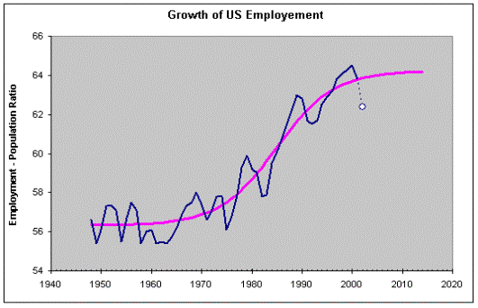
The second indicator is unemployment
shown in Exhibit 4 in terms of the Employment-Population ratio.

Exhibit 4. Annual data. The evolution of US employment
seems to be cyclical around the
S-curve that
describes the post-WWII growth phase. The white circle represents year 2002.
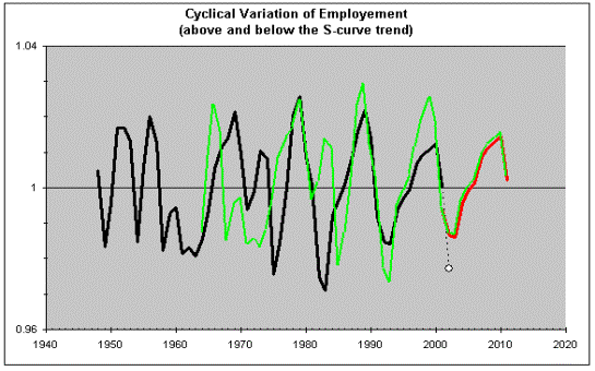
Employment in the US (in other
countries too) is cyclical and rather regularly so. Year 2002 came below the
trend, as had been forecasted, even if a little lower than forecasted. Exhibit 5
extracts and forecasts this cyclical variation. The 2002 data point came a
little below last year’s forecast and more in agreement of downward excursions
of previous years. 
Exhibit 5. The green line is the black one displaced by one cycle. This way we obtain the forecast (red line underneath the green one). The little circle is year 2002, in line with downward excursions of previous years.
Table 2
Forecasts (last year) Actuals New Forecasts
|
Year |
Employment to population
ratio |
Annual
% change |
|
|
|
|
|
2002 |
63.37983 |
-0.6% |
62.4 |
-2.2% |
|
|
|
2003 |
63.40474 |
0.04% |
|
|
62.43 |
0.05% |
|
2004 |
64.05384 |
1.02% |
|
|
63.08 |
1.04% |
|
2005 |
64.30176 |
0.39% |
|
|
63.34 |
0.41% |
|
2006 |
64.45865 |
0.24% |
|
|
63.52 |
0.28% |
|
2007 |
64.93283 |
0.74% |
|
|
64.01 |
0.77% |
|
2008 |
65.11312 |
0.28% |
|
|
64.21 |
0.31% |
|
2009 |
65.20382 |
0.14% |
|
|
64.32 |
0.18% |
|
2010 |
65.30616 |
0.16% |
|
|
64.45 |
0.19% |
The new forecasts are only marginally different than
last year’s. Unquestionably employment is presently on the rise and will
continue so at least until 2010.
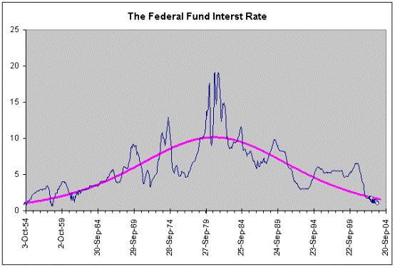
The last indicator is interest rates. Exhibit 6
shows the data since the early 1950s fitted to a bell-shape curve. The reason
for a bell-shaped curve is that interest rates reflect the rate of
growth (investments themselves may grow along S-curves). Once again, we find
that last year’s forecast was rather accurate (the actual data came a little
lower) and the growth process is practically completed (96%), meaning that the
interest rates should not change significantly from the 1.5 level for a long
time to come. Table 3 compares last year’s forecasts with actuals.

Exhibit 6. Monthly data. The purple line is a
bell-shaped curve fit to the data. The little circles indicate the last 12
months.
Table
3
Forecasts
(last year)
|
Year |
Interest rate |
|
Actuals |
|
|
Oct-02 |
1.83 |
|
1.75 |
|
|
Nov-02 |
1.81 |
|
1.34 |
|
|
Dec-02 |
1.79 |
|
1.24 |
|
|
Jan-03 |
1.78 |
|
1.24 |
|
|
Feb-03 |
1.76 |
|
1.26 |
|
|
Mar-03 |
1.74 |
|
1.25 |
|
|
Apr-03 |
1.72 |
|
1.26 |
|
|
May-03 |
1.70 |
|
1.26 |
|
|
Jun-03 |
1.69 |
|
1.22 |
|
|
Jul-03 |
1.67 |
|
1.01 |
|
|
Aug-03 |
1.65 |
|
1.03 |
|
|
Sep-03 |
1.63 |
|
|
|
|
Oct-03 |
1.62 |
|
|
|
|
Nov-03 |
1.60 |
|
|
|
|
Dec-03 |
1.58 |
|
|
|
CONCLUSIONS
Among wide speculations that American
economy may be on the rebound, the above evidence corroborates indeed that
employment is on the rise and will continue so until 2010. Also that interest
rates will grow a little as they are presently below the level of 1.6, where
they should be according to the natural curve. However, the rate of growth of
the GDP is expected to go slowly but steadily down, and continue doing so …
indefinitely! The top graph in Exhibit 3 is such a textbook like S-curve, that
in no way justifies expecting deviations from the projected course. The only
way to envisage important deviations is following unnatural
circumstances. “Unnatural” in this context means circumstances unlike any other
encountered during the historical window. The growth wave we are presently
riding was triggered by WWII. So only events comparable in importance to WWII
can launch the economy on a new major S-curve. The Iraq war and 911 may not
qualify. In the absence of the “missing” war, stock market frequenters will
have to rely upon short-term market excursions upward or downward, which will
always be there.