|
|
Market Update
March 6,
2009
—————————————————————————————————————
Copyright © 2009 by Theodore Modis. All rights
reserved including the right of reproduction in whole or in part in any form.
—————————————————————————————————————
Update
with data including March 3, 2009
Treating the DOW
as a species permits long-term forecasts. These forecasts are expected to hold
in absence of “mutations” such as
changes in the composition of the Dow Jones Industrial Average (DJIA). The last
change was in 19-Feb-2008 when Bank of America and Chevron replaced Atria Group
and Honeywell. The change before that was in 8-Apr-2004 when American International
Group, Pfizer, and Verison replaced AT&T, Eastman Kodak, and International
Paper. These two changes delimit the periods over which the DOW can be treated
as a species.
Using the approach described
in my book An S-Shaped Trail to Wall Street I fitted S-curves on the evolutions
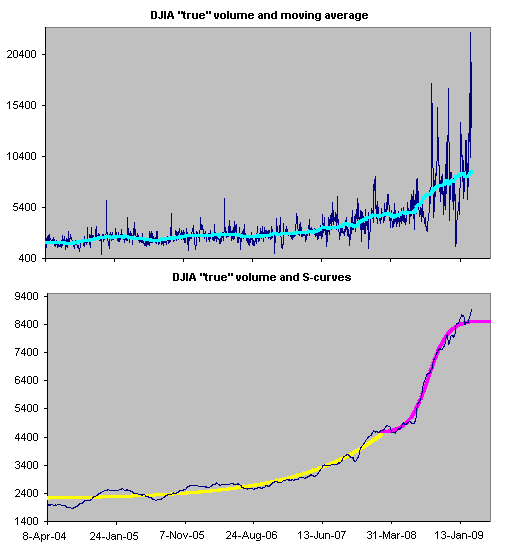
of the DJIA’s share volume and the dollar value. Exhibit 1 shows the “true” share
volume, i.e. the share volume adjusted for splits. To eliminate the large daily
fluctuations a 4-month moving average has been constructed and fitted with two
different S-curves before and after the date 19-Feb-2008 when a “mutation” took
place.

Exhibit 1. At the top we see the DJIA share volume (corrected for splits) and a 4-month
moving average (turquoise line). At the bottom, two S-curves (yellow and purple
lines) are fitted on the moving-average data over the two periods during which
the DOW composition did not change.
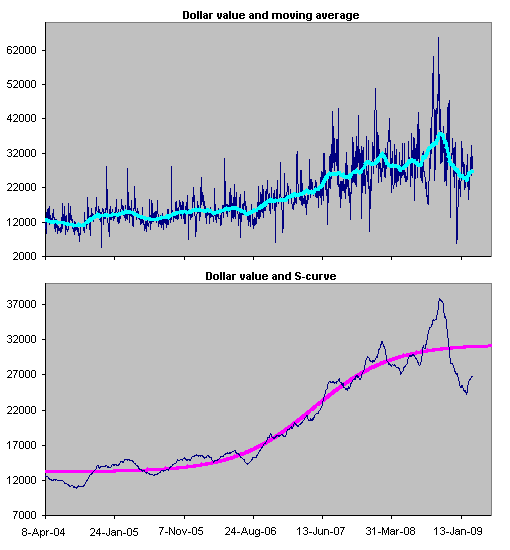
Similarly with the dollar value daily exchanged. Exhibit 2 shows that one single S-curve can describe the whole period. It appears that the change in DOW’s composition on 19-Feb-2008 did not interfere with the evolution of this variable. After all, the competition for shares is independent from the competition for dollars.

Exhibit 2. At the top we see the DJIA dollar value and a 4-month moving average (turquoise
line). At the bottom, the S-curve (purple lines) is fitted on the moving-average
data over the entire period.
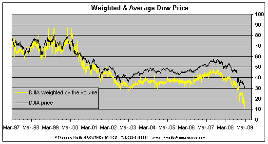
The S-curves from Exhibits 1 and 2 can be used to make a forecast for the DJIA as calculated by weighting prices with share volumes. This weighted DJIA is closely correlated with the published DJIA despite the fact that there has been a gap between the two for a number of years. This gap is due to the fact that in the last five years investors have been favoring low-price DOW stocks, see Exhibit 3.

Exhibit 3. The average DOW price (black line) and the weighted average DOW price (yellow line). The gap between the two installed around early 2003 is indicative of a shifting preference for low-price stocks.
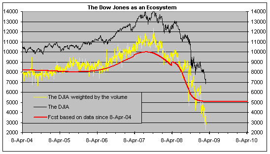
The DJIA forecast as determined by the ratio of the S-curves is shown in Exhibit 4 (red line). The discontinuity visible in 19-Feb-2008 was expected. The long-term forecast of the DJIA is a flat horizontal line because the two component S-curves have both reached the ceiling. The level of this line is equal to the average of the last 75 working days of the weighted DJIA. By analogy, the level of the DJIA forecast translates to 8237.

Exhibit 4. The DJIA as daily quoted (black line) and as calculated via the weighted average price (yellow line). The red line is the forecast as determined via the ratio of the S-curves in Exhibits 1 and 2.
CONCLUSION
Despite recent alarmingly low values, the long-term level of the DJIA should be around 8200. This level (with fluctuations above and below) is expected to persist for at least five months (comparable to the range of the last S-curve in Exhibit 1), or until the next change in the composition of the DJIA.
