————————————————————————————————
Monthly Discussion
S.A.R.S.
The successful forecast made in Predictions concerning the limited growth potential for AIDS in the US has prompted a number of requests to forecast SARS. Whereas the number of SARS victims is much smaller than that of AIDS ten years ago¾and no argument can be made yet of competition between SARS and other diseases¾I attempt below an S-curve description of the SARS epidemic on the principle that public awareness and intense targeted efforts can result in limiting the spreading of an epidemic.
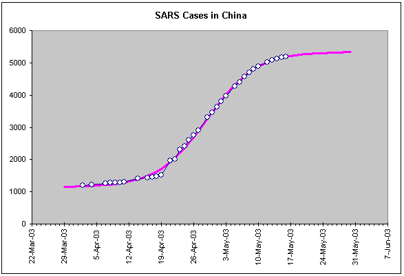
Exhibit 3 shows the spreading of SARS in China from the moment the government of that country decided to report the facts realistically. We do not see the early diffusion of SARS in China, but the number of cases has followed an S-curve rather closely during the last two months.

Exhibit 3.
The evolution of the number of SARS cases in China from the moment the
government there decided to report the facts accurately. The purple line is an
S-curve fit.
The fitted S-curve is almost complete
and the agreement with the data is better in late April and May when the
Chinese authorities intensified their containment efforts. This agreement is
evidence that containment efforts are now working better than in early April
when sporadic outbursts make the data points jump over and under the curve. The
obvious forecast is that, barring new contamination in uncharted regions of
China, the number of new SARS cases in China should soon drop to zero. And even
in the case of new contaminations, the Chinese will be able to deal with it.
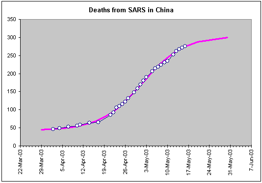
The number of deaths from SARSA in
China is not quite at the end of its growth pattern, see Exhibit 4. Barring new
diffusion centers, we expect another 30 or so (that is, 10% more) deaths.

Exhibit 4.
The evolution of the number of deaths from SARS in China. One may want
to discern a finer structure of smaller S-curves within the overall S-shaped
pattern.
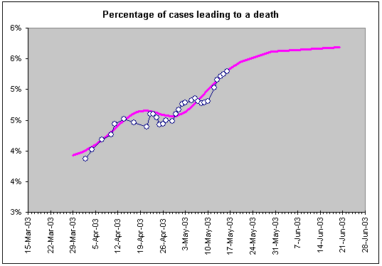
The ratio of deaths to cases has been
reported as a stable few percent. Looking at Exhibit 5, however, we conclude
that this ratio is a function of time and generally increases, which is not
unreasonable because it there is a delay between contracting SARS and dying
from it. Consequently, the percentage of deaths will continue growing for
several days beyond the end of new cases reported. The final percentage for
China is 5.7% of deaths from SARS cases. This number is likely to be the same
for other countries.

Exhibit 5. The percentage of SARS cases that lead to a
death in China. The purple line is not a fit to the data but the ratio of the
S-curve fitted in Exhibit 4 divided by the S-curve fitted in Exhibit 3.
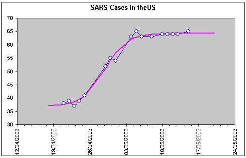
There have been 2 deaths and 65 cases
reported in the United States so far. The evolution of the number of cases,
shown in Exhibit 6, seems to have already reached a ceiling. Barring new
centers of contamination in the country, the additional number of deaths from
SARS expected in the US is only 3 or 4.

Exhibit 6.
SARS case reported for the United States. A declining number means that
some cases thought to be SARS were later proved not to be so. These
fluctuations give a measure of the uncertainty in the data. We are missing the
early stages of the disease’s development because before April 21 the US did
not report SARS cases but a much larger number of suspected cases.
This report has concentrated on China
because it has been at the origin of this disease and also because it shows the
highest statistics. As one World Health Organization official put it, if SARS
is not contained in China it is simply not contained. But all odds show that SARS
will be contained in China, and other countries as well.
______________________________
The data come from the World Health Organization,
http://www.who.int/csr/sarscountry/en/