————————————————————————————————
Monthly Discussion
The Bubble Indicator – Revisited
This month's
discussion updates the bubble indicator as described in An S-Shaped Trail to Wall Street
(pp 75-79) and last updated in this Newsletter issue of May 17, 2004.
The approach in
brief
Using the notion
of relative price one can objectively understand whether the market is
overvalued or undervalued and estimate how close we may be to bursting a bubble
or to bottoming out from a major dip.
The DJIA that we study and forecast in this Newsletter is calculated from
the average DOW price weighted by the share volume. This price is calculated as
the ratio of the DJIA’s dollar value over the DJIA’s share volume and is
expressed in dollars. The same ratio, but with dollar value and share volume
expressed as percentages of the NYSE totals, defines a relative price. Relative
price is nothing else but the DOW's average price divided by the NYSE's average
price.* The
relative price gives a more realistic description of how DOW moves. It may
reveal, for example, that DOW’s poor performance is not so poor after all, or
that an apparently good performance is not that good.
It is true that DOW's performance and NYSE's performance are strongly
correlated (that's why we use the DOW as an index!) But in a particular day it
may be that the average NYSE stock gains 15%, while the average DOW stock only
3%. In this case DOW's performance must be considered rather poor. In contrast,
if some day the average NYSE stock drops by 5% while the DOW remains unchanged,
the latter's performance should be considered as rather good.
Large-capitalization stocks present more resistance to the whims of the
market (small-capitalization stocks are know to be more "fickle"). We
can therefore use the relative price as a barometer for detecting exaggerated
market moves, be it in the direction of overstating or understating. This is a
dynamic detection process, i.e., it can only be done on the move, as things
change with time. For example, if DOW's price increases between two dates more
than the DOW's relative price between the same dates, the DOW is overstating
the market and we are having a bubble situation. If DOW's price decreases
faster than its relative price, we have an under-valued market most likely to
be followed by a bull market. Large bubbles can burst with a crash. Following a
crash, the total NYSE value generally finds itself below the real value, and a
bull market is likely to follow.
During an overstated market both the NYSE and the DOW may form bubbles,
but the two bubbles do not generally grow at the same rate. The difference
between the percentage change of the DJIA average price and its relative price
is proportional to the size of the bubble. Therefore a null difference is
evidence that there is no bubble.
The bubble
indicator updated
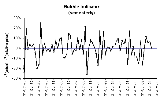
Exhibit 3 shows
that the average price and the average relative price of the 30 industrials
moved hand in hand for most of the last 35 years (most of the points are close
to the zero line). Occasionally we see important excursions upward with price
increasing faster than relative price, or downward with relative price
increasing faster. Let us look more closely at some large excursions in each
direction. From the three tallest spikes (bubbles) in 1971, 1975 and 1987 only
the last one burst abruptly. An undervalued market preceded the first two
bubbles, which is what may have caused the formation of these bubbles in the first
place. If it is true that a bubble sometimes forms as a reaction to an
undervalued market, it may be reasonable to conclude that such a bubble is not
likely to burst via a crash but rather diffuse via a more gentle mechanism
(soft landing). After all, the amplitude of the 1975 bubble exceeded that of
1987, and yet it did not burst.
Conversely among the largest market undershoots that we see in
Exhibit 3, only the one in 1987 should be interpreted as a reaction to the
bubble that preceded it. In that light, we can say that the other market dips
not preceded by bubbles were caused by more deeply seeded reasons. But in
general, when undershoots are followed by overshoots, the latter cane be seen
as reactions to the former.
To summarize, a bubble or a dip of the market can be viewed as action or
reaction, depending on whether it initiates a deviation from zero, or follows a
deviation from zero. The relative-price indicator obviously enhances our
ability to predict reactions more than actions.
Finally, it must be noted that six-month samples are
not appropriate for slow moving bubbles and dips like the bubble leading to the
bear market during 2000-2002. In this case both the up and the down movement
spread over several semesters.

Exhibit
3. Based on the last 35 years (points every
six months), we can say that bubbles and dips of the market do not extend
beyond 25 percentage points in the difference between the average DJIA price
and its relative price. On May 31, 05 we are in a situation of neither bubble
nor undervalued market.
We also see in Exhibit 3 that during late 2003 and
early 2004 the market was on the bubble side, which can be interpreted to some
extent as a reaction since undervalued market preceded it (see Oct-2002).
However, the bubble indicator on May 31, 05 was
right on zero meaning an honest market hiding neither bubbles nor
under-valuations. Neither a bull market nor a crash needs to follow. Bubbles
burst and dips trigger bull markets when the amplitude of the indicator
excursion approaches 20 percentage points or more.
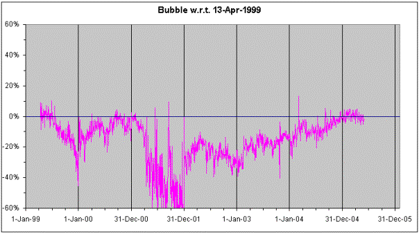
Exhibit 4 shows a somewhat different bubble
indicator. We see here variable sampling with finer time resolution. We are
looking at daily data to detect a possible bubble or under-valuation with
respect to April 13, 1999. This date is appropriate to compare to because a
that time the DOW was at a comparable level as today, the weighted DJIA was
close to the DJIA, which was close to the long-term forecast (see Exhibit 1); a
sort of text-book situation.
We see in Exhibit 4 that following April 1999 the
DJIA went undervalued until late 2000 in a rather smooth non-violent way. A
violent dip appeared in the later part of 2001 and much of that turbulence had
non-financial origins (911). But since then this bubble indicator edged upwards
coming to levels very similar to those of April 13, 1999. Exhibit 4
corroborates the conclusion of Exhibit 3 that at the end of May 05 there is
neither overstated nor understated market.
Exhibit 4 demonstrates better than Exhibit 3 the
classic by now bursting of “The bubble” because as we mentioned earlier
six-month sampling is too rapid to describe a process spread over a whole year.

Exhibit 4. Daily data indicate the existence of an undervalued market with respect to April 13, 1999.
CONCLUSION
The
conclusion is that the market today is neither overstated nor understated, just
as it was in April 1999. The difference now is that in sharp contrast to the
situation in 1999—when the DJIA agreed with the weighted DJIA—today the gap
between them is as big as ever, see difference between yellow and black lines
in Exhibits 1 and 2.
This difference is due to the fact that low-priced
stocks are traded disproportionably more often than higher-priced stocks. In
particular, the two highest share volumes belong to INTC and MSFT with
respective prices of $27.5 and $25.6 while the average DOW price is closer to
$47. The share volumes of INTC and MSFT, however, are ten times bigger than
typical volumes of other DOW stocks. These two latecomers to the blue-chip club
are not quite of the same “pedigree” and are mainly responsible for the gap
between yellow and black lines in Exhibits 1 and 2.
Still, the DJIA and the weighted DJIA remain strongly correlated and by all accounts a flat horizontal continuation of the market seems to be the best bet.