————————————————————————————
Monthly Discussion
Energy Needs
The state of the economy strongly depends on the energy picture, and in particular energy supply, energy demand, and prices of energy. Traditional economic theory argues vehement in favor of a number of theoretical relationships between these three quantities. At the same time, more “enlightened” thinking has come up with some iconoclastic ideas, such as, that oil supply may be a function only of how much we need it (see Predictions). Whatever the truth may be it is of interest to better understand our needs for energy and how they will evolve with time.
Before reading below try to answer the following
question, to the best of your ability. “How much has energy consumption per
capita increased in the US during the last 150 years?”
If your answer is a factor of a thousand or more,
you must be easily impressionable. If your answer is one hundredfold, you are
among the average; and if your answer is a factor of 10 to 20, you are
generally well informed. However, the right answer is a factor of only 3.5!
Impossible? Only if you neglect the improvements in efficiency during the same
period. It turns out that our efficiency in using energy has increased by a
factor of about 10 over the last 200 years. So the combined increase reflecting
the use of energy is a factor of
3.5
x 10 = 35.
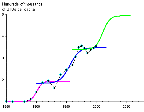
Exhibit 3 shows the evolution of the annual energy
consumption per capita in BTUs (British Thermal Units*). Energy consumption grew over 150 years following two successive
S-shaped patterns. A third S-shaped pattern is sketched in green and is modeled
on the previous two. The two periods of stagnation between S-curves last for a
couple of decades each time and started in 1910 and then again in 1985.
Whenever energy consumption stops growing—worse, if
it declines—the whole economy follows suit. In fact it is not obvious which one
comes first. But one thing is sure, energy consumption and economic health are
strongly correlated. The cyclical variation of energy consumption from one
S-curve to the next reflects the larger Kondratieff cycle (see Predictions)
according to which the second stagnation period that started in 1985 is just
about over, and that is what the third S-curve outlines.
US Annual Energy
Consumption per Capita

Exhibit
3. The data (black dots) have been
fitted with two S-curves (purple and blue lines). The green line is a scenario
for a future; an S-curve modeled on the previous two. The centers of the
S-curves are at 1900, 1955, and 2010, and mark the onset of economic booms
(Kondratieff cycle).
Today’s level of annual energy consumption is 3.5
times that of 1850. A factor of 3.5 could not account for all the spectacular
achievements—most of them requiring the heavy use of energy—in American society
over this period. The “missing” energy comes from improvements in the
efficiency with which energy is exploited.
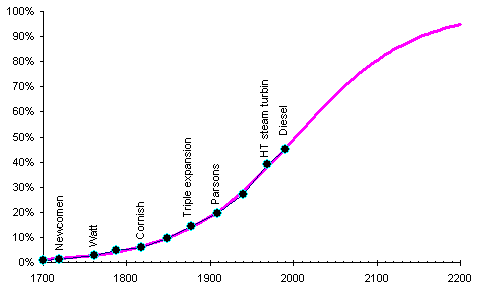
Exhibit 4 shows a typical example of efficiency
improvements in the use of energy. It lists engines using primary energy, their
date of appearance, and their efficiency in producing useful output. Despite
the fact that the best engines today are still less than 50% efficient, the
progress since the early steam engines is at least a factor of 45. Other
examples of efficiency improvements, such lighting and ammonia production, also
show much progress but still relatively low efficiencies today.
Evolution of Engine Efficiency
Exhibit
4. The evolution of engine technology.
The S-curve has been fit on the data but its ceiling has been constrained at
100%. Most of the data for this curve have been read off a graph by Marchetti.*
It should not be surprising
that the efficiency curve covers a much longer period than the
energy-consumption curves. Efficiency can theoretically increase only up to
100%. In practice, Exhibit 4 says that more than 90% efficiency should not be
expected before the 23rd century.
In contrast, annual energy consumption is not
necessarily capped at 3.5, or 5 BTUs per capita, which will be reached in the
late 2020s according to the scenario in Exhibit 3. S-curves can cascade, and a
yet another S-curve may follow the green one.
For the time being, despite the gloomy economic
environment, we are positioned at the beginning of a growth phase in energy
consumption. By 2010 this growth cycle will be in full steam and will coincide
with the highest rate of efficiency gains ever. Even if energy consumption goes
up by only 7% between years 2000 and 2010, as the purple curve indicates in
Exhibit 4, the effective increase in “useful” energy over the same period will
be closer to 25%.
If
prosperity results from economic growth, which in turn follows energy
consumption, and these relationships are linear, than in the period 2000-2010
our prosperity will grow as much as it did in the period 1975-2000!
