Monthly
Discussion
What Does It
Take for the DOW to Pick up Again?
This
question was raised by a newsletter subscriber recently, which prompted me to
give my answer in the form of a monthly discussion topic.
Understanding the DOW as an ecosystem
involves studying the evolution of the share volume and the dollar value
exchanged over DOW stocks (see An S-Shaped trail to Wall Street). In
particular, we are trying to identify for these two variables natural-growth
patterns (S-curves) that can be projected in the future. Forecasts for the DJIA
will then follow from the ratio value/volume that gives the average DOW price weighted
by the share volume. For the forecast of Exhibit 1 the ingredients dollar value
and share volume can be seen respectively in Exhibit 3 (purple line) and
Exhibit 4 (yellow line). Both exhibits depict the early parts of S-curves
(practically exponential patterns).
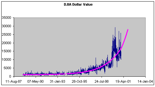
Exhibit
3. Data and S-curve fit (purple line).
The data points are daily.
The DJIA
(and the average DOW price) results from a ratio and for it to increase either
the numerator (dollar value) must increase or the denominator (share volume)
must decrease. Since ratios are sensitive to small changes in the denominator,
one way of achieving DOW’s turnaround is for the share volume to slow down its
rate of growth even by very little. For example, the purple line in Exhibit 4
is constructed to resemble the natural fit (yellow line) but it features slower
growth and results in an up-pointing DJIA (turquoise line in Exhibit 5). A
small change in the trajectory of the share volume makes a significant change
in the long-term forecast of the DJIA. Does this fact render the forecast
unreliable?
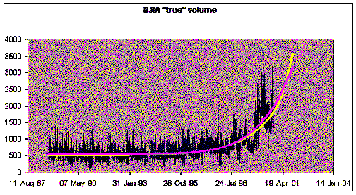
Exhibit
4. Data and S-curve fit (yellow line).
The purple line is a curve constructed to resemble the S-curve fit but cause an
upward-pointing DJIA forecast. “True” volume refers to the share volume
corrected for stock splits. The data points are daily.
Not really! The difference between
purple and yellow lines in Exhibit 4 may seem unimportant, and eyeball judgment
may consider either one satisfactory. But when my software program fits 12
years’ worth of daily data points it prefers the yellow-line solution.
Moreover, there is a catch. The scenario for DJIA growth requires a toned down
growth for the share volume but unchanged growth for the dollar value,
which is rather significant.
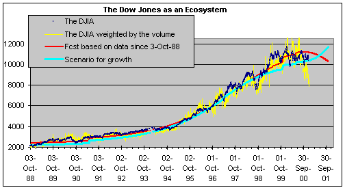
Exhibit
5. Scenario for growth (see text). The
drawing is the same as Exhibit 1 with the addition of the turquoise line.
To decrease the share volume while keeping the
dollar value unchanged means that investors should play the same amount of
dollars every day but distribute it in such a way that the share volume
decreases. In other words, investors should progressively shift their
portfolios to higher-price stocks. At older times, this would mean a shift
toward high-capitalization blue chips since traditionally they enjoyed high
prices. But recently the average DOW price has dropped exceptionally low. Not
only newcomer technology stocks have ended up low-priced (e.g., INTC and MSFT)
but also classic veterans of the high-price club such AXP, GE and JPM find
themselves now at the low-price range following a number of splits and
“rearrangements”. An upward turnaround of the weighted DJIA at his point
requires a shift of dollar value from such stocks as INTC, MSFT, GE, T, C, MO,
JPM and HWP to such stocks as MMM, JNJ, PG, IBM, MRK and XOM. This eventuality
cannot be ruled out but this shift would have to persist long enough for the
fit in Exhibit 4 to come out closer to the purple line than to the yellow
one.
But how else can the DOW pick up again?
Besides the obvious way, namely that stock prices
increase across the board—I let the reader appreciate this eventuality—there is
also the possibility that our analysis treating the DOW as a species is no
longer justified as of a certain date because the DOW underwent a major
“mutation” at that date and became a different species. In such a case we
should try to fit S-curves only from that day onward instead of since
3-Oct-1988. It is conceivable that fitting only the last few years’ worth of
data, or say the last 15 months, could result into an up-pointing forecast for
the DOW. But one must be able to defend such a decision. In my mind, the entry
of INTC and MSFT is not tantamount to a major mutation, nor is the proliferation
of stock splitting. Phenomena like this are commonplace in DOW’s history.
In lack of other arguments, I will put my bets on
the long-term forecast as presented in Exhibit 1.