————————————————————————————————
Monthly Discussion
The US
Presence in Iraq
As the June-30th
date approaches expectations rise that this date will mark the beginning of US
disengagement from Iraq. In this Newsletter we examine the possibility that US
engagement in Iraq follows a natural-growth pattern. The thinking behind this
assumption is that we are dealing here with a well-defined military endeavor
that has a beginning, a growth phase, a maturity phase, decline, and an end,
and its evolution is subject to the law of competition (survival of the
fittest). In this light, we can compare/contrast it with the older and
well-documented Viet-Nam military endeavor.
If we take as a measure the number of US soldiers killed, Exhibit 3 shows
that this number has steadily grown from the beginning of the Iraq war but
showed signs of slowing down toward the end of February 2004. A natural-growth
process up to March 2004 indicates an operation practically completed (around
90% of the S-curve’s ceiling).
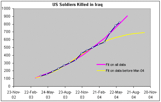
Exhibit 3. US soldiers killed in action in Iraq. Two
S-curve fits are shown: based on data before mid-March 2004 (yellow line), and
based on all data up to mid June 2004 (purple line). The data, reported here
monthly, come from “Faces of Valor”.
However, after mid-March the rate of casualties increased significantly. But taking more recent data into account, the end-of-February slowdown takes on the hue of a “fluctuation” and a more important S-curve (in purple) indicates that the process may only be 26% completed by mid-June 2004.
If we now look at the
Viet-Nam data, we see that its S-curve requires more than 5 years to become
completed, see Exhibit 4. Notice that we have much more statistics here and
therefore no fluctuations are visible. The agreement between the data-point
pattern and the S-curve is excellent.
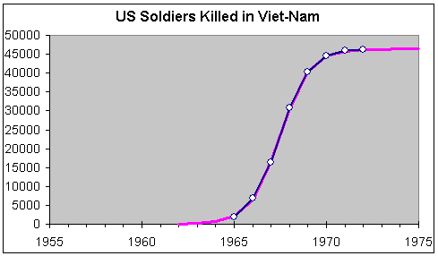
Exhibit 4. US
soldiers killed in Viet Nam and S-curve fit. The data are reported yearly.
To make a meaningful
comparison between Iraq and Viet Nam we need to look at similar timeframes. In
Exhibit 5 we show the same time scale—if displaced by almost 38 years—and we
project an evolution over the next ten years.
In the lower graph of
Exhibit 5, the data points cover only a small segment of the S-curve. This fact
reflects on the reliability of the forecast. Iraq’s S-curve, based on such a
short historical window, may turn out to be considerably lower (or higher!)
than the ceiling of 3,500 victims indicated. Still, there are things we learn.
First, the similarity
between the two S-curves of Exhibit 5 argues for a much longer involvement in
Iraq than advertised in the media. Casualty numbers should culminate around
April 2005 and subside only toward the end of 2007. Second, no matter how uncertain this forecast is, it is safe to
expect in Iraq a final number of victims at least an order of magnitude smaller
(i.e. a factor of 10) than the number of victims in Viet Nam. All this, of
course, if “natural” conditions prevail, and by that I mean conditions like the
ones during the last couple of years. A new (different) government is not such
a condition. To the extent that this government has been intimately involved in
the Iraq war, it constitutes “genetic material” for the growing “species.”
Under a significantly
different government the evolution of the lower graph in Exhibit 5 may
significantly deviate from the S-shaped pattern indicated.
Comparing
Iraq to Viet Nam
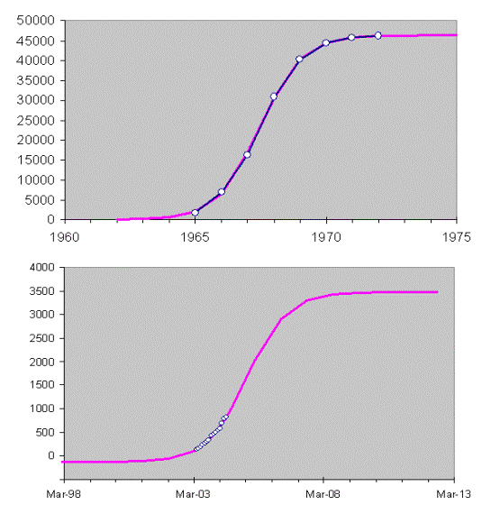
Exhibit 5.
Viet-Nam victims are shown at the top. Iraq victims are shown at the
bottom. The S-curve from Exhibit 3 is redrawn here with a timeframe similar to
that of Exhibit 4. The similarity of the two curves is striking, but the level
of the ceiling in the lower graph is rather uncertain due to the shortness of
the historical window.