————————————————————————————————
Monthly Discussion
Atlantic Tropical Hurricanes
and Kondratieff’s Cycle
Headlines about hurricanes this year seemed bigger
and more frequent than previous years.
Indeed by November 30th we had seen 17 tropical storms over
the Atlantic out of which 6 had winds more than 110 miles per hour thus
qualifying for hurricane category 3 or higher.
Last year out of 16 tropical storms 3 had qualified for category 3 or
higher. In contrast, during the first 5
years of the 20th century in a total of 37 tropical storms (an
average of 5 per year) there were only 2 hurricanes of category 3. Coupled with rumors about global warming and
climate change these observations make one wander what to expect in the years
to come.
I
decided to look at this evolution of hurricanes from the point of view of a
natural growth process. In other words,
as if some “natural” cause provokes this increase in frequency and strength of
tropical storms and consequently the phenomenon should have a growth phase, a
maturity phase, and an eventual death.
I obtained detailed data on hurricanes since 1851 from the Tropical Prediction Center Best Track
Reanalysis. I retained data
only about hurricanes of category 3 and higher and grouped them together in
buckets of decades.
I was not surprise to discover not one but three natural-growth
steps. By now I am accustomed to expect
S-curves cascading to cover an extended period of time.
Exhibit 3 shows the cumulative number of hurricanes from 1850 onward. We
can discern three comparable-size S-curves (purple, yellow, and
turquoise). If one zooms back, one can
argue that a large-scale S-curve could describe the overall evolution of the
number of hurricanes and we only see a short fragment of this large-scale
process in Exhibit 3 (thick gray line).
But more intriguing is the variation up and down this general trend as
the three S-curves go through their respective rapid and slow phases of growth.
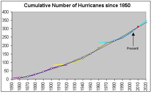
Exhibit 3. The graph shows the cumulative number of
Atlantic tropical hurricanes of category 3 or greater. The three colored S-curves have been adapted
on the corresponding data points. The
thick gray line is an S-curve adapted to the overall set of data. The red dot is a projection for the first
decade of 2000 based on years 2001-2004.
To get a better idea about what to expect in the near future I have
constructed the life cycle curves that correspond to the three S-curves of
Exhibit 3. The three cycles are
shown in Exhibit 4 and they peak on years 1900, 1960, and 2016 respectively,
while the maximum number of hurricanes per year practically doubles between
1900 and 2016.
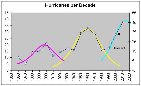
Exhibit 4. This graph is constructed from the data in
Exhibit 3. The three life cycles
correspond one to one to the three same-color S-curves in Exhibit 3. The red dot is a projection for the first
decade of 2000 based on years 2001-2004.
It is not obvious what phenomena are responsible for the progressive increase of the number and intensity of hurricanes over the last 150 years but global warming could well have something to do with it. But it is even less obvious why there are three peaks (or three S-curves).
Two things are clear. One, that we are going to see more hurricanes per year in the years to come until the mid 2010s after which date their number should begin to decrease for a while. Two, that this ebb and flow of hurricane waves resonates with the Kondratieff cycle. This observation gives support to one hypothesis given in Predicitons for the origin of Kondratieff’s economic cycle, namely climatic change. Exhibit 5 compares the variation of the number of hurricanes per decade to Kondratieff’s cycle as determined in Predictions. There is fair agreement over three periods.
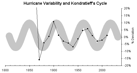
Exhibit
5. The data points show the percentage
deviation of the number of hurricanes per decade from the overall S-curve trend
(thick gray line) in Exhibit 3. The
“snake” here is a sinusoidal wave with period 56 years (Kondratieff’s cycle)
and width 5 percentage points. The
first data point falls outside the graph because of statistical fluctuation (is
+50% of a very small number, see Exhibit 4).