————————————————————————————
Monthly
Discussion
Success
Stories
Discussing
success stories concerning predictions in Predictions that have come
true is more than sheer self-advertising. Confirmed trends become predictions
themselves, but now they carry more weight than the first time around.
Listed below are such predictions in
striking agreement with what happened during the 10-15 years that followed.
|
Prediction made in Predictions (based on data up to the
late 1980s) |
Outcome |
|
The
rate of AIDS fatalities in the US will stop growing by mid 1990s. |
Many
experts today wonder why the AIDS threat had been so over-estimated. |
|
There
will be some event that will dramatically reduce coal production in the UK |
One
month after the publication of Predictions the UK government ordered
the closing of 61% of all mining pits in the country. |
|
Speed
limits in the US will drift upwards. |
Speed
limits have been systematically raised across the country, and states like
Nebraska experimented with lifting them all together. |
|
Nuclear
accidents will drop to about one every five years |
There
have been no nuclear accidents to speak off. |
|
Nuclear
energy as a source of primary energy is far from dead. |
The
Bush administration is seriously considering a revival of nuclear energy. |
But more precisely I include below
updates of four drawings that appeared in Chapter 8 of Predictions. In
each drawing the energy consumption cycle serves as clock timing the
Kontratieff economic wave. The new data points are indicated with dark circles
permitting a visual comparison with the predicted trend (rose band).
The first drawing, Exhibit 3, shows that as we come
out of a boom, banks begin to have difficulties that lead into recession and
economic hardship. But as the difficulties intensify so does the appearance of
innovations and discoveries in general (hard times are fertile times!) Lacking
data on the appearance of recent basic innovations (a personal compilation
would be too easily branded as subjective), I use data on patents to update
this graph.
Activities That Echo the Energy Consumption Cycle
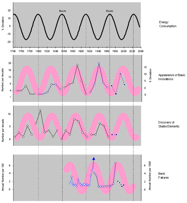
Exhibit
3. There are two sets of data for
innovations. Before 1960 the data come from Gerhard Mensch's book Stalemate
in Technology. The update points (dark circles) refer to the appearance of
patents, and in particular, to % deviation from the growing trend of patents.
There are three sets of data for bank failures: bank suspensions before 1933,
banks closed due to financial difficulties between 1940-1985, and percentage of
banks loosing money for the period 1985-1999 (dark circles). In all graphs, the
dark circles indicate recent data not included in Predictions.
Exhibit 4 demonstrates the coupling
between energy prices and the type of primary energy used. In particular the
figure points out that energy prices flare up regularly and periodically (about
every 56 years) around the midpoint of the energy cycle, when the primary
energy in question dominates the world market. Oil prices increased manifold
around 1981 when oil's market share was maximum. Since that time, the market
share of oil has been declining and the next manifold flare up of energy price
should be around 2030 and should rather concern the price of natural gas.
Appropriately the updated data points on annual averages of oil prices (black
dots) have been hovering at the expected level.
Energy Prices, Consumption, and Substitution, All Synchronized
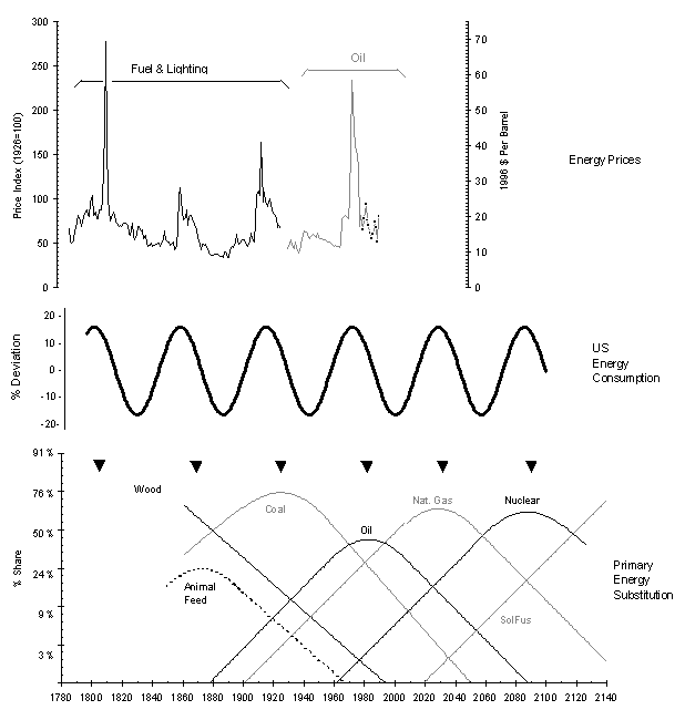
Exhibit
4. Annual averages for the price of
energy and the substitution of energy types for the worldwide energy
consumption (only the idealized trends are shown here; the reader is referred
to the Newsletter issue of June 18, 2001 for the full details). The black
triangles point at the peak of each primary energy source's dominance. These
points in time coincide with price flares and the beginning of economic
decline. Energy prices during the last 15 years (black dots) nicely conform to
the expected trend.
In Exhibits 5 and 6 the reader will find updates of
a number of indicators that describe various aspects of our lives. In all cases
the variation is cyclical and resonates with Kontratieff's cycle. In all case
the new data (dark circles) conform with the trend and enhance the cyclical
character of the indicator in question. For example, during the late 1980s and
the 1990s, life expectancy increased and so did the performance in breaking the
one-mile run record, while fatalities from cirrhosis of the liver were down.
All this corroborates the picture that people sober up during hard times that
have a beneficial effect on health (the reader must remember that the time
period in question, late 80s to early 90s, was a time of a serious recession in
the US). And feminism has indeed been going down, if we "measure" it
via the female content of Nobel Prize laureates.
More Phenomena Pulsating with the Energy Consumption Cycle
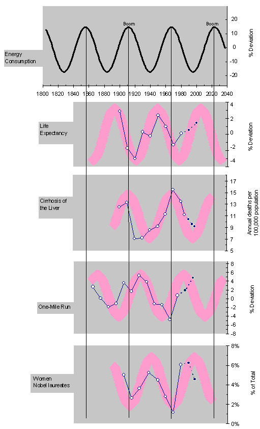
Exhibit
5. The graphs on life expectancy and
the one-mile run record have been obtained in a way similar to the energy
consumption, namely as a percentage deviation of the data from a fitted S-curve
trend. The number of women Nobel laureates is expressed as a percentage of all
laureates in a decade. For the case of cirrhosis the annual mortality is used.
Homicides and criminality in general have declined
during the last 15 years as had been predicted in Predictions. A couple
of years ago The New Yorker referred to the lowering of criminality as
an "epidemic" that had subsided. Homicides can be expected to decline
even further as we plow into more prosperous years. Similarly the woman-to-man
ratio as the victim in homicides has remained within the predicted band.
However, there is evidence for significant discrepancy concerning the use of murder
weapon.
Morbid Activities Also Resonate with the Same Rhythm
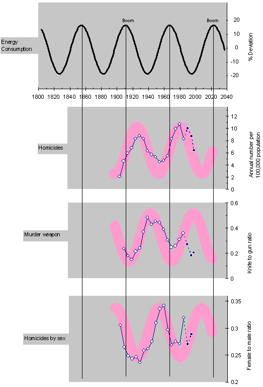
Exhibit
6. Homicides, the murder weapon, and
the ratio of women to man as victim. With the exception of the murder weapon,
recent data (black dots) confirm the predicted trends.
The pictured that emerged in Predictions
had murderers show a preference for stabbing men during economic recessions and
shooting at women during economic booms. But from Exhibit 6 we see that
murderers have refused to really give up the gun during the 1990s. The
knife-to-gun ration should have continued upward for longer before declining
again (see 3rd graph down). This ratio is supposed to decline (i.e. guns begin
become popular again) during boom years, and we are not there yet (next boom is
due around 2020). Perhaps, the precautious economic recovery in America (see
monthly discussion in the Newsletter of April 23, 2001) combined with the gun's
relentless popularity may have "confused" murderers into using the
gun prematurely, instead of the knife that would have been more
"natural" at this time.
By
and large the above predictions from Predictions have been confirmed.
Therefore the purple bands in the exhibits can now serve as forecasts with
enhanced confidence. Surprises are to be expected only for situations where an
indicator grows (or declines) faster than "normal", be it a
stock-market index or the popularity of guns.